'Separated Separados'
- Emily Palmer
- Jul 29, 2020
- 1 min read
Separated Separados is a catalogue that visually explores the fragile reality of migrant children being separated from their families on the Southern U.S. boarder. It involves many designers giving their own visual representation of what is going on, whether that is purely made up of type and lettering or mark making and shapes. The main idea is to sell these catalogues to make profits, which go to benefit detained migrant children in the U.S.

I was drawn to the catalogue through ‘Its’s Nice That’ because of the colour scheme of red and blue. The colour palette is striking which creates a bond between the message and the catalogue itself. Furthermore, because the catalogue is in two languages (Spanish and English) this gives a stronger link for the whole catalogue.
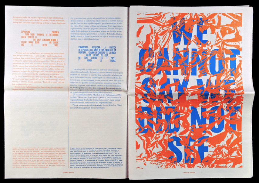

The printed catalogue almost reminds me of the propaganda used in the war to get people to join as troops due to the typefaces used as they are so striking. It can link to propaganda as the idea of the catalogue is to express the situation of the migrants, to encourage people to buy the print so that these detained migrant children can get some kind of help. It is a form of encouragement.
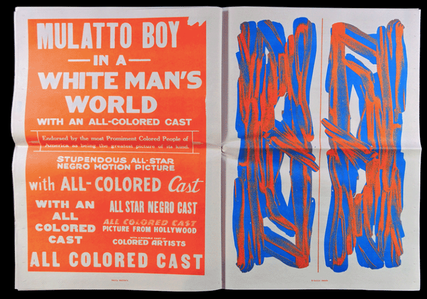
I find it encouraging that there are many contributors that helped design the catalogue because it shows that people are passionate about helping these migrant children. Even though these designers had individual designs and ways to express their take on representing the situation, it shows that differences can come together to create something amazing!
You know what to do!...
Emily :)
( all images are from https://separated.site )


Comments